Show the code
pacman::p_load(ggbraid,imager,readxl,lubridate,zoo,plotly,GGally,DT, patchwork,ggHoriPlot,CGPfunctions,gganimate,tmap,tmaptools,sf,tidyverse)To uncover the impact of COVID-19 as well as the global economic and political dynamic in 2022 on Singapore bi-lateral trade (i.e.Import, Export and Trade Balance) by using appropriate analytical visualisation techniques.
Merchandise Trade provided by Department of Statistics, Singapore (DOS) will be used. The study period should be between January 2020 to December 2022.
pacman::p_load(ggbraid,imager,readxl,lubridate,zoo,plotly,GGally,DT, patchwork,ggHoriPlot,CGPfunctions,gganimate,tmap,tmaptools,sf,tidyverse)Note that by default, read_excel will guess column types. We can provide them explicitly via the col_types argument.
# define column types (ct): if starts with "Data" is text, or else if numeric.
nms <- names(read_excel("data/SGTrade.xlsx",sheet = "T1",range = cell_rows(10)))
ct <- ifelse(grepl("^Da", nms), "text", "numeric")
export <- read_excel("data/SGTrade.xlsx",sheet = "T1",range = cell_rows(10:101),col_types = ct)
import <- read_excel("data/SGTrade.xlsx",sheet = "T2",range = cell_rows(10:129),col_types = ct)

# can use the following to check the type of each column
# sapply(import,mode)

#filter dataset 2020Jan to 2022Dec.
import <- import %>%
  select(c('Data Series','2022 Dec' : '2020 Jan'))

export <- export %>%
  select(c('Data Series','2022 Dec' : '2020 Jan'))
Merchandise Exports: Refer to all goods taken out of Singapore.
Merchandise Imports: Refer to all goods brought into Singapore.
DT::datatable(export, options = list(pageLength = 5))DT::datatable(import, options = list(pageLength = 5))The code chunk below perform the necessary data wrangling to
1. remove total and region by removing the first 7 rows
2. rename the first column as country and remove the ‘(thousands dollars)’ behind each country name using regular expression. Note that () are special chars and need to be escaped with backslashes.
colnames(export)[1] <- "country"
export <- export %>%
  #Keep country level data
  filter(!row_number() %in% c(1:7)) %>%
  #rename the country by removing the (Thousand Dollars)
  mutate(country = str_replace_all(country,"\\(|Thousand Dollars|\\)",""))

colnames(import)[1] <- "country"
import <- import %>%
  #Keep country level data
  filter(!row_number() %in% c(1:7)) %>%
  #rename the country by removing the (Thousand Dollars)
mutate(country = str_replace_all(country,"\\(|Thousand Dollars|\\)",""))To prepare time series friendly data, we need to transform tibbles.
export_long <- export %>%
  #create timeseries tibble
  pivot_longer(cols = !country,names_to = "month",values_to = "value" ) %>%
  # convert month to datetime
  separate(month, into = c("year", "month_abb"), sep = " ", convert = TRUE) %>%
  mutate(numeric_month = match(month_abb,month.abb)) %>%
  mutate(Month = as.Date(as.yearmon(paste(year,numeric_month),"%Y %m"))) %>%
  mutate(Value = value * 1000) %>%
  select(country,Month,Value)
#Order by time
export_long <- export_long[order(export_long$Month),]


import_long <- import %>%
  #create timeseries tibble
  pivot_longer(cols = !country,names_to = "month",values_to = "value" ) %>%
  # convert month to datetime
  separate(month, into = c("year", "month_abb"), sep = " ", convert = TRUE) %>%
  mutate(numeric_month = match(month_abb,month.abb)) %>%
  mutate(Month = as.Date(as.yearmon(paste(year,numeric_month),"%Y %m"))) %>%
  mutate(Value = value * 1000) %>%
  select(country,Month,Value)

import_long <- import_long[order(import_long$Month),]

# Add column of type
export_long <- export_long %>%
  add_column("type" = "export")
import_long <- import_long %>%
  add_column("type" = "import")
The time series friendly table can be viewed as shown below.
DT::datatable(export_long, options = list(pageLength = 5))DT::datatable(import_long, options = list(pageLength = 5))The size of import and export tables are different. In order to compare the export and import of the same country, we need to remove countries that does not appear in both tables. Let us first use full join to combine two tables and filter out the countries with at least one NA in import value or export value. Countries only in export:
country <-full_join(export_long, import_long, by=c('country','Month'))

export_na <- country[is.na(country$Value.x),]
import_na <- country[is.na(country$Value.y),]
unique(export_na$country)
[1] "Norway " "Liechtenstein "
[3] "Netherlands Antilles " "Panama "
[5] "Bahamas " "Bermuda "
[7] "French Guiana " "Grenada "
[9] "Guatemala " "Honduras "
[11] "Jamaica " "St Vincent & The Grenadines "
[13] "Trinidad & Tobago " "Anguilla "
[15] "Other Countries In America " "Nauru "
[17] "Cocos Keeling Islands " "French Southern Territories "
[19] "Norfolk Island " "Cook Islands "
[21] "Kiribati " "Niue "
[23] "Tuvalu " "Wallis & Fatuna Islands "
[25] "Micronesia " "Palau "
[27] "South Sudan " "Commonwealth Of Independent States "Countries only in import:
unique(import_na$country)character(0)We can conclude that there are 28 countries that Singapore only imported from but did not export to them. Finally, let us create the Singapore import and export trade table, in long and wide, by excluding the 28 countries.
exclude_country <- unique(export_na$country)
sg_long <- rbind(export_long,import_long) %>%
  filter(!country %in% exclude_country) %>%
  mutate(country = trimws(as.character(country)))
sg_wide <- pivot_wider(sg_long, names_from = type, values_from = Value)DT::datatable(sg_long, options = list(pageLength = 5))DT::datatable(sg_wide, options = list(pageLength = 5))total_long <- sg_long %>%
group_by(Month,type) %>%
summarise(Value = sum(Value))
total_wide <- sg_wide %>%
group_by(Month) %>%
summarise(import = sum(import),
export = sum(export))
p1 <- ggplot() +
geom_line(aes(Month, Value, color = type, linetype = type), linewidth = 1, data = total_long) +
geom_braid(aes(Month, ymin = import, ymax = export, fill = export < import), data = total_wide, alpha = 0.6) +
guides(linetype = "none", fill = "none") +
scale_y_continuous("Trade(in billion SGD)",
labels = function(x){paste0('$', abs(x/10^9))}) +
scale_x_date(limits = c(min(sg_long$Month),max(sg_long$Month)),
date_breaks = "6 month",
date_labels = "%Y-%m",
expand = c(0,1)) +
labs(title = 'TOTAL MERCHANDISE TRADE, Singapore 2020 to 2022',
subtitle = 'Singapore had 3 years in a row with a trade surplus',
caption = 'The shaded red area indicates trade surplus (export > import).') +
annotate(geom = "segment", x = as.Date('2020-04-01'),xend = as.Date('2020-08-01'),
y = 39946596*10^3, yend = 55*10^9) +
annotate(geom = "segment", x = as.Date('2020-08-01'),xend = as.Date('2021-02-01'),
y = 55*10^9, yend = 47668437*10^3) +
annotate(geom = "text", x = as.Date('2020-08-11'), y = 58 * 10^9,
label = "trade plunged in 2020\n but recovered sharply in 2021") +
theme_minimal() +
theme(plot.title = element_text(face = "bold", size = 18),
plot.subtitle = element_text(size = 12),
axis.text.x = element_text(angle = 30, hjust = 1))
p1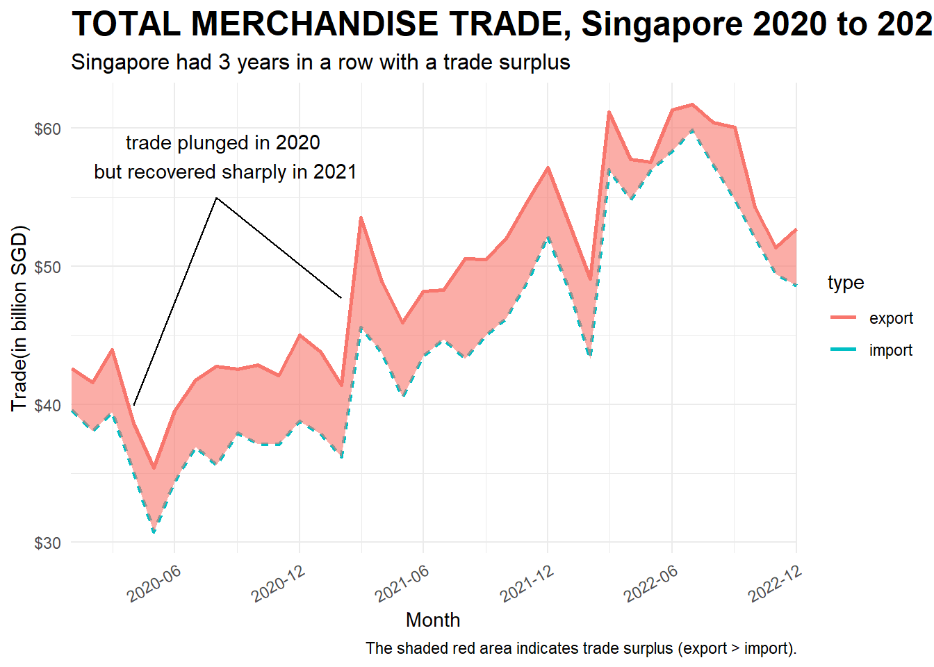
ggplotly(p1)Singapore has a 3 years in row of trade surplus. The trade plunnged in 2020 due to the travel restriction, but recovered sharply in 2021. In 2022 Feb, both import and export dropped and at the same time, the Russia-Ukraine War started. After the trading volume peaked at 3rd quarter of 2022, it started to drop untill the end of 2022.
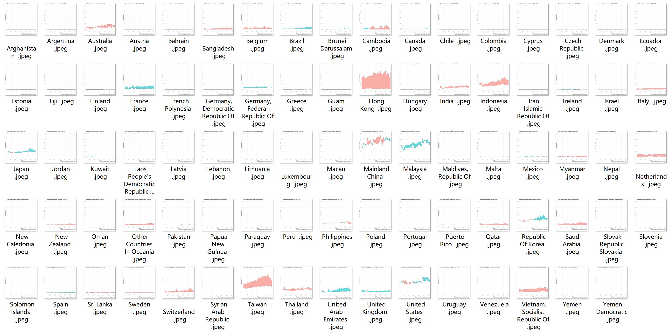
First, we plot the trade balance between singapore and each trade partner and save the image as jpep.
plot <- function(cname){
  country_long <- sg_long%>%
    filter(country == cname)
  country_wide <- sg_wide %>%
    filter(country == cname)
  country_wide

  ggplot() +
  geom_line(aes(x = Month, y = Value, color = type, linetype = type), data = country_long) +
  geom_braid(aes(Month, ymin = import, ymax = export, fill = export < import), data = country_wide, alpha = 0.6) +
  guides(linetype = "none", fill = "none") +
  scale_y_continuous(limits = c(0,10*10^9)
                     #,"Trade(in billion SGD)"
                     ,labels = function(x){paste0('$', abs(x/10^9),"B")}) +

  scale_x_date(limits = c(min(sg_long$Month),max(sg_long$Month)),
               date_breaks = "12 month",
               date_labels = "%Y-%m",
               expand = c(0,1)) +

  labs(title = paste(cname)
       , y = ""
       ,x = ""
       #Add the following when you plot to save as jpeg
       #,subtitle = ('Trade between Singapore and the partner 2020 to 2022')
       #,caption = 'The shaded red area indicates trade surplus (export > import).\nThe shaded blue area indicates trade deficit (export < import).'
       ) +
  theme_bw() +
  theme(plot.title = element_text(face = "bold", size = 12),
        plot.subtitle = element_text(size = 12),
        axis.text.x = element_text(angle = 30, hjust = 1))

# Use the following code to plot for all countries, hence we can select which one we want to discuss.
  #ggsave(paste("country_trade/",cname,".jpeg"))
#}

# the following codes are run to save the trade balance of each country as image
#countries <- unique(sg_long$country)
#for (c in countries){
  #plot(c)}
}
The screenshot of all the countries are as shown below. Note that we fix the range of y-axis to compare the trading volume.
Let us focus one a few representative trading partners.
# Manually choose a few countries, carefully set the theme of each one
mcn <- plot("Mainland China") + theme(legend.position = "none")
us <- plot("United States")+ theme(legend.position = "none")+ theme(axis.text.y=element_blank(),axis.ticks.y=element_blank())
kr <- plot("Republic Of Korea")+ theme(legend.position = "none")+ theme(axis.text.y=element_blank(),axis.ticks.y=element_blank())
jp <- plot("Japan")+ theme(legend.position = "none")+ theme(axis.text.y=element_blank(),axis.ticks.y=element_blank())


my <- plot("Malaysia") + theme(legend.position = "none")
hk <- plot("Hong Kong")+ theme(legend.position = "none")+ theme(axis.text.y=element_blank(),axis.ticks.y=element_blank())
indo <- plot("Indonesia")+ theme(legend.position = "none") + theme(axis.text.y=element_blank(),axis.ticks.y=element_blank())
aus <- plot("Australia")+ theme(axis.text.y=element_blank(),axis.ticks.y=element_blank())

#use patchwork to combine
patchwork <- (mcn|us|kr|jp)/(my|hk|indo|aus)
patchwork + plot_annotation(
  title = "Singapore Merchandise Trade with Major Partners",
  subtitle = "Export to Mainland China reached new high in 2021Q4 and 2022Q2, falled in 2022 Q3 and Q4
  \nExport to US, Korea and Japan did not recover to 2020 level") &
  theme(plot.title = element_text(face = "bold", size = 10),
        plot.subtitle = element_text(size = 8),
        axis.text.x = element_text(angle = 30, hjust = 1))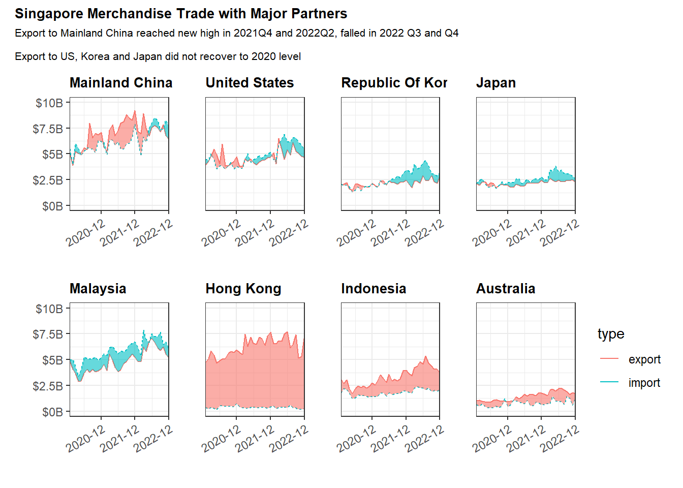
Above are 8 major trade partners with high trading volume. Mainland China is Singapore largest trading partner, and the export to Mainland China reached new high in 2021 Q4 and 2022 Q2, started to fall in 2022 Q3. Singapore’s export to US, Korea and Japan did not recovered to 2022 Level.
Singapore had 3 years in a row of trade deficit with Malaysia, and had 3 years in a row of trade surplus with Hong Kong, Indonesia and Australia, where the trade surplus with Hong Kong is the greatest. Singapore has a much more consistent import from HongKong than the export to Hong Kong.
In the diagram above, we hand picked a few countries to show the comparison between import and export. How can we plot the massive time series of import and export of many countries?
Let us use horizon plots to show the trend of all the countries.
# Compute trade balance, i.e. difference between import and export
trade_balance <- sg_wide %>%
  mutate(Balance = import - export)


#As there are negative values in balance, we need to normalize them.  We need to use two colors two represent trade surplus(red) and trade deficit, but not how big are the difference between export and import.
#Our goal is to set the minimum (or maximum negative value to be 0).
norm <- function(x) {
  (x - min(x))/(max(x)-min(x))
}
trade_balance <- trade_balance %>%
  mutate(balance = norm(Balance))

# Find top traders based on trading volume, add a rank column to the table
top_country <- sg_long %>%
  group_by(country) %>%
  summarise(total_volume = sum(Value)) %>%
  filter(total_volume > 10^9) %>%
  arrange(desc(total_volume))
top_country$rank <- 1:nrow(top_country)
top_country <- top_country %>%
  mutate(Rank = str_replace(rank,"\\d+",purrr::as_mapper(~sprintf('%02d',as.numeric(.x)))))


# Filter country in top_country with trading volumes more than $1B(10^9)
trade_balance <- trade_balance %>%
  filter(country %in% top_country$country)


# Left Join two tables, aim to add the rank column in the trade_balance table
trade_balance <- merge(x = trade_balance, y = top_country[,c("country","Rank")], by = "country", all.x = TRUE)

#Note that the balance_point's balance is not 0. We need to calculate it when export = import.
balance_point <-
  (0-min(trade_balance$Balance))/(max(trade_balance$Balance) - min(trade_balance$Balance))
#balance_point = 0.6+

# change the country name to rank + country name
trade_balance <- trade_balance %>%
  mutate(r_country = paste(Rank,country)) %>%
  select(-c(export,import,country,Balance, Rank))
Let us draw the horizon plot. The table can be viewed in the second tabset.
 hori <- trade_balance %>%

  #filter(country %in% top_country$country) %>%
  ggplot() +
  geom_horizon(aes(x = Month, y=balance),
               origin = balance_point,
               horizonscale = 6)+


  facet_grid(r_country~.) +
    theme_bw() +
  scale_fill_hcl(palette = 'RdBu') +
  theme(panel.spacing.y=unit(0, "lines"), strip.text.y = element_text(
    size = 5, angle = 0, hjust = 0),
    legend.position = 'none',
    axis.text.y = element_blank(),
    axis.text.x = element_text(size=7),
    axis.title.y = element_blank(),
    axis.title.x = element_blank(),
    axis.ticks.y = element_blank(),
    panel.border = element_blank()
    ) +
    scale_x_date(expand=c(0,0), date_breaks = "3 month", date_labels = "%b%y") +
  labs(
    title = "Singapore's Trade Balance against major partners with volume more than $1B",
    subtitle = "Singpore's Trade Voleme increased, but Surplus decreased",
    captions = "Red: trade surplus; Blue: trade deficit\nTrade partners are arranged by trade volumes"
  )
hori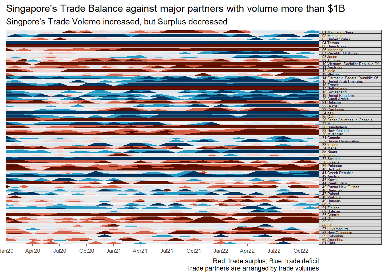
DT::datatable(trade_balance, options = list(pageLength = 5))Note: the numeric values in front of the country name represent the rank of the total trading volumes (export + import).
First impression of the diagram is that the color of either blue or red is darker on the right side. It means that the trade volume increased.
However, The blue are darker on the right side than on the left side, hence we conclude Singapore trade surplus decreases. The conclusion is affected by import exceeds import happened in 01 Mainland China, 03 United States,07 Republic of Korea and 08 Japan.
There are also many single colored bars. It represents that the relationship(surplus or deficit) between Singapore and those top traders are consistent. Those trade partners including: 02 Malaysia, 04 Taiwan, 05 Hong kong, 06 Indonesia, 09 Thailand, 10 Vietnam and etc.
Slope graph is useful to emphasis on the changes of the measures over time. It is visually encoded by the slope of the line. The countries are arranged vertically and the change of the order reveals the ranking of countries with respect to the corresponding parameter.
# Prepare the dataset with 3 parameters, import volume, export volume and trade balance for the year 2020 and 2022
slope_yr<- sg_wide %>%
  mutate(year = year(Month)) %>%
  group_by(year,country) %>%
  summarise(yr_import = as.integer(sum(import)/10^9),yr_export = as.integer(sum(export)/10^9),yr_bal = as.integer((sum(export) - sum(import))/10^9)) %>%
  mutate(Year = factor(year, ordered = TRUE, levels = c("2020","2021","2022"))) %>%
  filter (Year == 2020 | Year == 2022) %>%
  ungroup(Year) %>%
  select(Year,country,yr_import,yr_export,yr_bal)
slope_yr <- slope_yr[,-1]# Let us work on import first.
# We will color code the slope line by black = no change in ranking, red = rank up, blue = rank down.
#Rank in 2020
ct_imp_rank_2020 <- slope_yr %>%
filter(Year == 2020) %>%
arrange(desc(yr_import)) %>%
select(-c(yr_import,yr_export,yr_bal))
ct_imp_rank_2020$rank_2020_imp <- 1:nrow(ct_imp_rank_2020)
#Rank in 2022
ct_imp_rank_2022 <- slope_yr %>%
filter(Year == 2022) %>%
arrange(desc(yr_import)) %>%
select(-c(yr_import,yr_export,yr_bal))
ct_imp_rank_2022$rank_2022_imp <- 1:nrow(ct_imp_rank_2022)
#compute the change in rank
imp_rank_chg <- merge(x = ct_imp_rank_2020[,c("country","rank_2020_imp")],y=ct_imp_rank_2022[,c("country","rank_2022_imp")],by = 'country')
imp_rank_chg <- imp_rank_chg %>%
mutate(change = rank_2020_imp-rank_2022_imp) %>%
mutate(ave_rank = (rank_2020_imp+rank_2022_imp)/2)
#Color code
import_country_choose <- imp_rank_chg %>%
filter((ave_rank < 10 | change > 5 | change < -5) & ave_rank < 30) %>%
mutate(country_color = ifelse(change == 0, 'black',ifelse(change > 0, 'red','blue')))
# find some representative countries: average of the ranking in both years < 10, or the change in rank is greater than 5.
country_import_slope <- unique(import_country_choose$country)
import_slope_data <- slope_yr %>%
filter(country %in% country_import_slope)
import_slope <- CGPfunctions::newggslopegraph(import_slope_data,
Year,
yr_import,
country,
LineColor = import_country_choose$country_color,
Title = "Import Ranking Change from 2020 to 2022",
SubTitle = "Ranking of top 4 countries did not change \n
Korean and United Arab Emirate ranked up, the othres ranked down",
Caption = "Black: rank does not change; red: ranked up; blue: ranked down",
DataTextSize = 3,
DataLabelFillColor = "gray",
DataLabelPadding = .2,
DataLabelLineSize = .5)
import_slope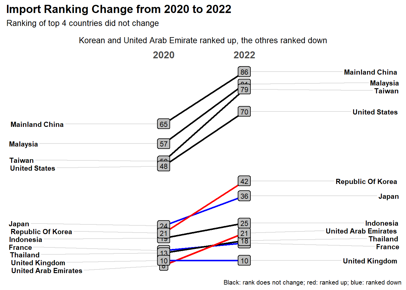
# Let us work on import first.
# We will color code the slope line by black = no change in ranking, red = rank up, blue = rank down.

#Rank in 2020
ct_exp_rank_2020 <- slope_yr %>%
  filter(Year == 2020) %>%
  arrange(desc(yr_export)) %>%
  select(-c(yr_import,yr_export,yr_bal))
ct_exp_rank_2020$rank_2020_exp <- 1:nrow(ct_exp_rank_2020)


#Rank in 2022
ct_exp_rank_2022 <- slope_yr %>%
  filter(Year == 2022) %>%
  arrange(desc(yr_export)) %>%
  select(-c(yr_import,yr_export,yr_bal))
ct_exp_rank_2022$rank_2022_exp<- 1:nrow(ct_exp_rank_2022)


#compute the change in rank
exp_rank_chg <- merge(x = ct_exp_rank_2020[,c("country","rank_2020_exp")],y=ct_exp_rank_2022[,c("country","rank_2022_exp")],by = 'country')
exp_rank_chg <- exp_rank_chg %>%
  mutate(change =  rank_2020_exp-rank_2022_exp) %>%
  mutate(ave_rank = (rank_2020_exp+rank_2022_exp)/2)

#Color code
export_country_choose <- exp_rank_chg %>%
  filter((ave_rank < 10 | change > 5 | change < -5) & ave_rank < 30) %>%
  mutate(country_color = ifelse(change == 0, 'black',ifelse(change > 0, 'red','blue')))


# find some representative countries: average of the ranking in both years < 10, or the change in rank is greater than 5.
country_export_slope <- unique(export_country_choose$country)


export_slope_data <- slope_yr %>%
  filter(country %in% country_export_slope)


export_slope <- CGPfunctions::newggslopegraph(export_slope_data,
                              Year,
                              yr_export,
                              country,
                              LineColor = import_country_choose$country_color,
                              Title = "Export Ranking Change from 2020 to 2022",
                              SubTitle = "Ranking of top 2 country/region did not change\n
                              Malaysia and Taiwan ranked up, others ranked down",
                              Caption = "Black: rank does not change; red: ranked up; blue: ranked down",
                              DataTextSize = 3,
  DataLabelFillColor = "gray",
  DataLabelPadding = .2,
  DataLabelLineSize = .5)


export_slope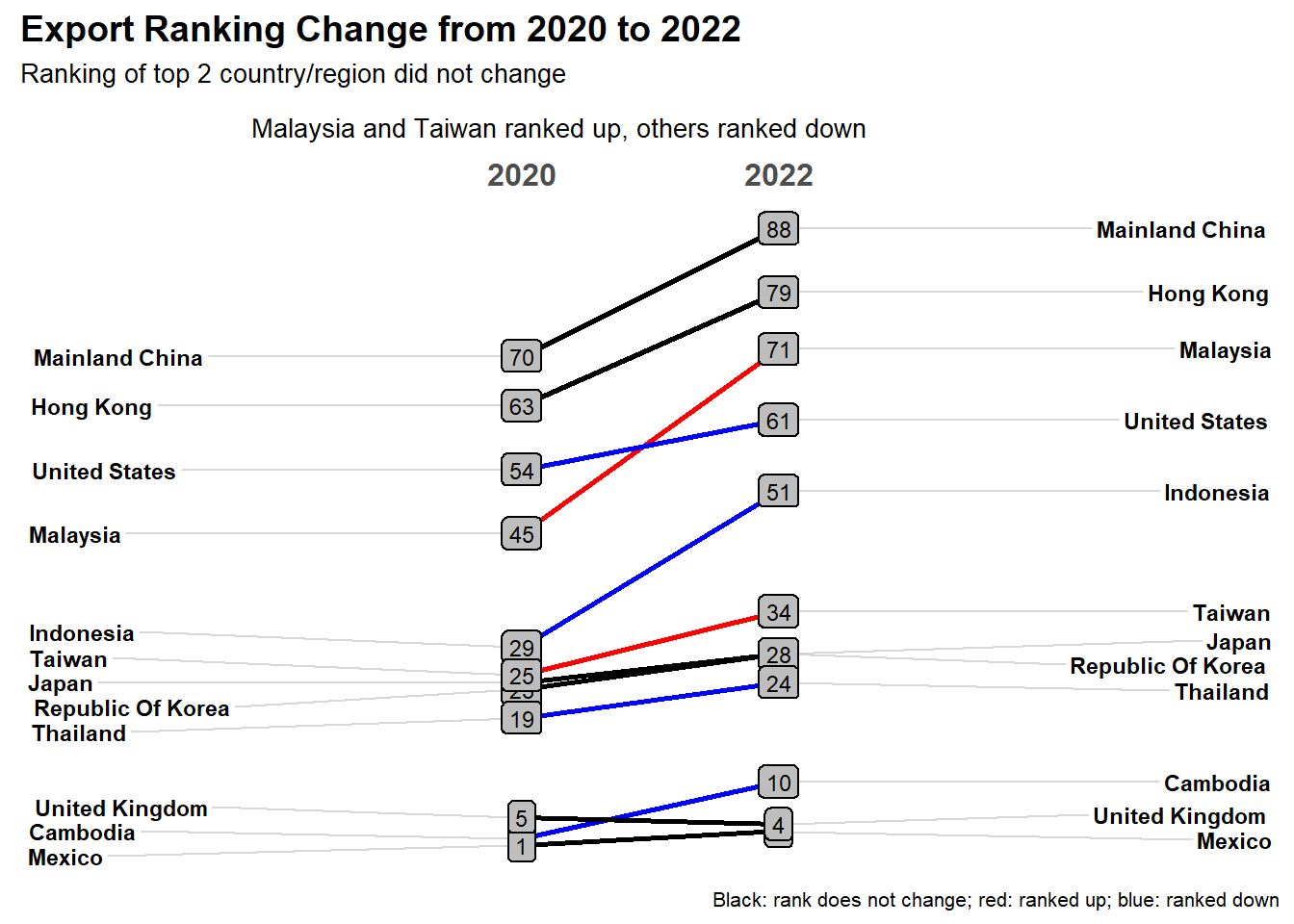
# Let us work on import first.
# We will color code the slope line by black = no change in ranking, red = rank up, blue = rank down.

#Rank in 2020
ct_bal_rank_2020 <- slope_yr %>%
  filter(Year == 2020) %>%
  arrange(desc(yr_bal)) %>%
  select(-c(yr_import,yr_export,yr_bal))
ct_bal_rank_2020$rank_2020_bal <- 1:nrow(ct_bal_rank_2020)

#Rank in 2022
ct_bal_rank_2022 <- slope_yr %>%
  filter(Year == 2022) %>%
  arrange(desc(yr_bal)) %>%
  select(-c(yr_import,yr_export,yr_bal))
ct_bal_rank_2022$rank_2022_bal <- 1:nrow(ct_bal_rank_2022)

#compute the change in rank
bal_rank_chg <- merge(x = ct_bal_rank_2020[,c("country","rank_2020_bal")],y=ct_bal_rank_2022[,c("country","rank_2022_bal")],by = 'country')
bal_rank_chg <- bal_rank_chg %>%
  mutate(change = rank_2020_bal-rank_2022_bal) %>%
  mutate(ave_rank = (rank_2020_bal+rank_2022_bal)/2)

#Color code
balance_country_choose <- bal_rank_chg %>%
  filter((ave_rank < 6| change > 5 | change < -5) & ave_rank < 30) %>%
  mutate(country_color = ifelse(change == 0, 'black',ifelse(change > 0, 'red','blue')))

# find some representative countries: average of the ranking in both years < 10, or the change in rank is greater than 5.
country_balance_slope <- unique(balance_country_choose$country)

balance_slope_data <- slope_yr %>%
  filter(country %in% country_balance_slope)

balance_slope <- CGPfunctions::newggslopegraph(balance_slope_data,
                              Year,
                              yr_bal,
                              country,
                              LineColor = balance_country_choose$country_color,
                              Title = "Balance Ranking Change from 2020 to 2022",
                              SubTitle = "Hong Kong has the greatest and most stable trade surplus\nIndonesia's trade balance ranked up",
                              Caption = "Black: rank does not change; red: ranked up; blue: ranked down",
                              DataTextSize = 3,
  DataLabelFillColor = "gray",
  DataLabelPadding = .2,
  DataLabelLineSize = .5,
  WiderLabels=TRUE)


balance_slope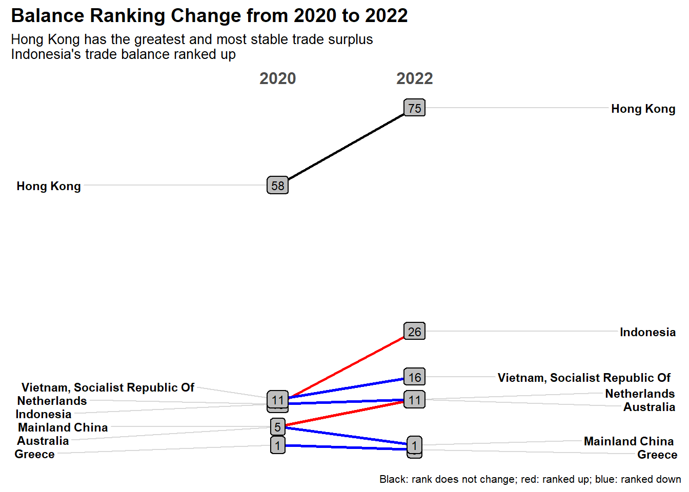
Finally, let us animate the export and import of major partners from 2020 to 2022.
bubble_data <- sg_wide %>%
  mutate(monthly_export = round(export/10^9,2),
         monthly_import = round(import/10^9,2),
         balance = round(monthly_import - monthly_export,2),
         monthly_total = round(monthly_export + monthly_import,2),
         sur_def = ifelse(balance > 0, "surplus", "deficit")) %>%
  select(Month,country,monthly_export,monthly_import,balance,monthly_total,sur_def)
#Order by time
bubble_data <- bubble_data[order(bubble_data$Month),]

bubble_plot <- bubble_data %>%
  filter(country %in% top_country$country[1:20]) %>%
  ggplot(aes(x=monthly_export, y = monthly_import, size = monthly_total,  fill = sur_def)) +
  geom_point(alpha = 0.8)+
  geom_abline(intercept = 0,slope = 1) +
  geom_label(aes(label = country)) +
  theme_classic() +
  theme(legend.position = 'none')+
  labs(title = "Merchandise Monthly Export vs Import from 2020 to 2022",
       subtitle = "Month: {format(frame_time, '%b%Y')}",
       x = "Export (Billion)", y = "Import (Billion)") +
  coord_equal() +
  theme(plot.title = element_text(size = 12, face = "bold"),
        plot.subtitle = element_text(size = 10),
        axis.line.x = element_line(color="black", size = 1),
        axis.line.y = element_line(color="black", size = 1),
        axis.title.x = element_text(size = 12),
        axis.title.y = element_text(size = 12),
        axis.text.x = element_text(size = 10),
        axis.text.y = element_text(size = 10))+

  transition_time(as.Date(Month)) +
  shadow_wake(wake_length = 0.1, alpha = FALSE) +
  ease_aes("linear")


bubble_ani<- animate(bubble_plot,fps = 10, duration = 30)
anim_save('trade_animation_fps20.gif',bubble_ani)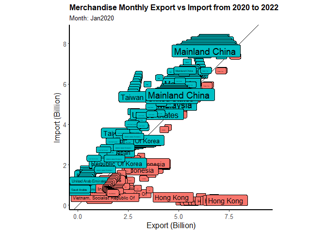
The red color represent the trade surplus and the blue color represent the trade deficit. The straight line split the region into two parts, upper triangular area represents deficits where all the blue rectangular boxes locate.
The size of each rectangular box is proportional to the trading volume. We choosed 20 countries with highest trading volume from 2020 to 2022.
There are some countries/regions’ color did not change, such as Hongkong(red) at the right bottom, or Malaysia (blue) and Taiwan moved along the line.
There are some countries such as Mainland China, locates on the top right corner with large size. Before covid, the color of Mainland China is blue, and it stared to change to red in 2020 May.
In general, we feel that there are much more blue boxes from Mar 2022 onwards. And the boxes move to top right corner from 2020 to 2022. It means that the trade volumes increased, and the trade deficit also increased.