pacman::p_load(corrplot,tidyverse,ggstatsplot,GGally)In-class Exercise 5 (Multivariate Analysis)
Correlation coefficient
Load packages
Read Data
wine <- read_csv("data/wine_quality.csv")Rows: 6497 Columns: 13
── Column specification ────────────────────────────────────────────────────────
Delimiter: ","
chr (1): type
dbl (12): fixed acidity, volatile acidity, citric acid, residual sugar, chlo...
ℹ Use `spec()` to retrieve the full column specification for this data.
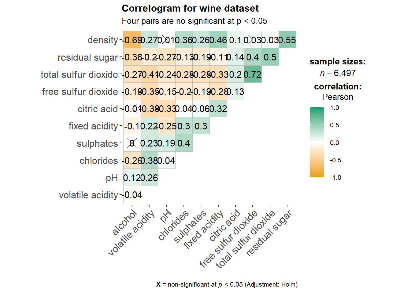
ℹ Specify the column types or set `show_col_types = FALSE` to quiet this message.Method 1: Correlogram
Single plot
ggstatsplot::ggcorrmat(
  data = wine,
  cor.vars = 1:11,
  ggcorrplot.args = list(hc.order = TRUE), # reorder according the hierarchical clustering
  title = "Correlogram for wine dataset",
  subtitle = "Four pairs are no significant at p < 0.05"
)
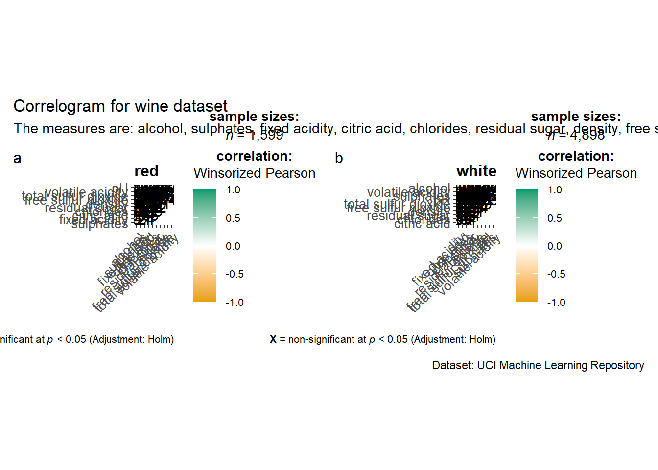
Multiple plots
provide USERs chances to choose paramaters when building shiny app
ggstatsplot::grouped_ggcorrmat(
  data = wine,
  cor.vars = 1:11,
  grouping.var = type,
  type = "robust",
  p.adjust.method = "holm",
  plotgrid.args = list(ncol = 2),
  ggcorrplot.args = list(outline.color = "black",
                         hc.order = TRUE,
                         tl.cex = 10),
  annotation.args = list(
    tag_levels = "a",
    title = "Correlogram for wine dataset",
    subtitle = "The measures are: alcohol, sulphates, fixed acidity, citric acid, chlorides, residual sugar, density, free sulfur dioxide and volatile acidity",
    caption = "Dataset: UCI Machine Learning Repository"
  )
)
Method 2: Corrplot
Provide opportunities to order the variables in the correlations matrix.
wine.cor <- cor(wine[, 1:11]) # compute the correlation matrix first
corrplot(wine.cor,
         method = "ellipse",
         tl.pos = "lt",
         tl.col = "black",
         order="hclust",
         hclust.method = "ward.D",
         addrect = 3)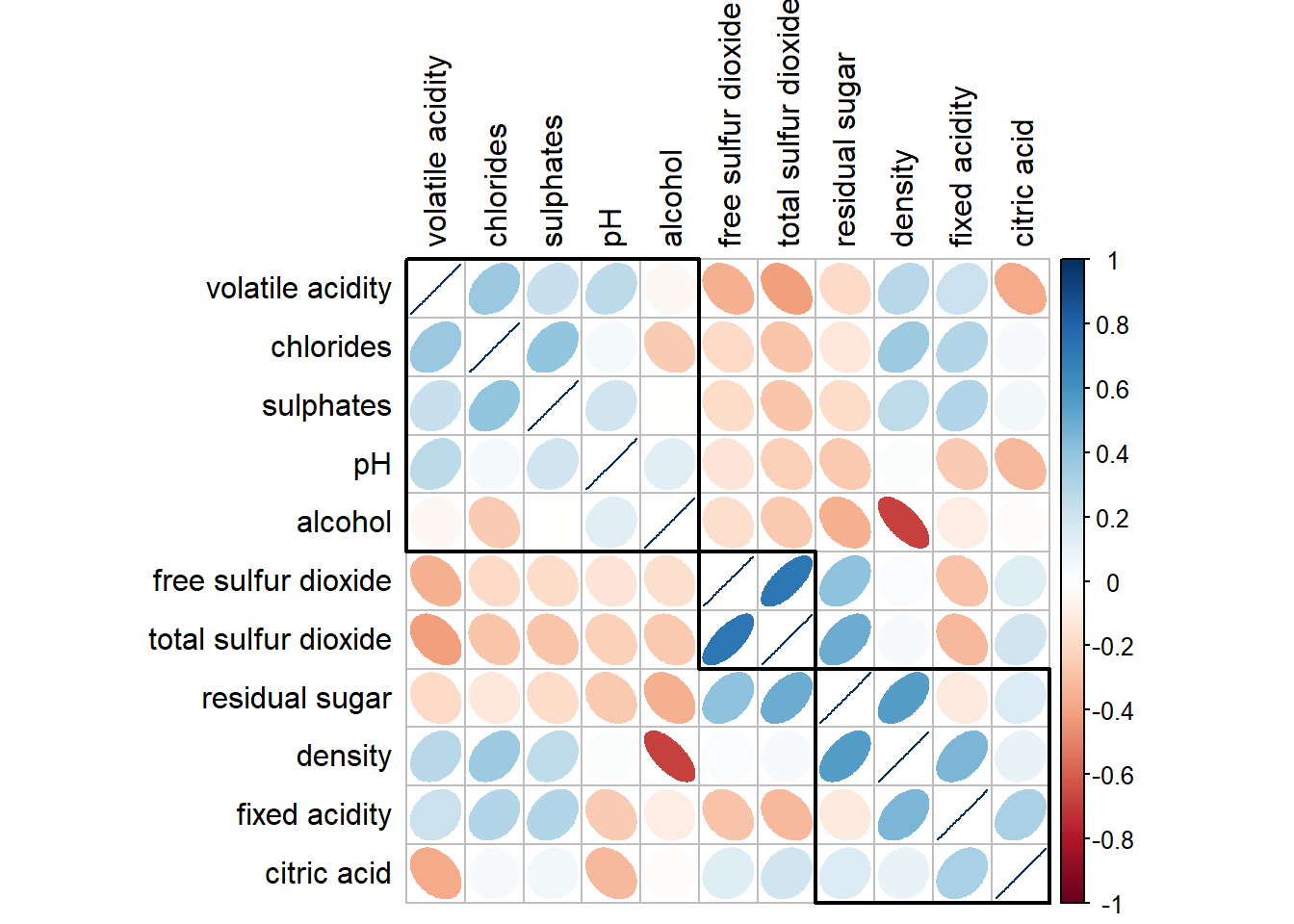
If you want to cross out the insignificant pairs:
wine.sig = cor.mtest(wine.cor, conf.level= .95)
corrplot(wine.cor,
         method = "number",
         type = "lower",
         diag = FALSE,
         tl.col = "black",
         tl.srt = 45,
         p.mat = wine.sig$p,
         sig.level = .05)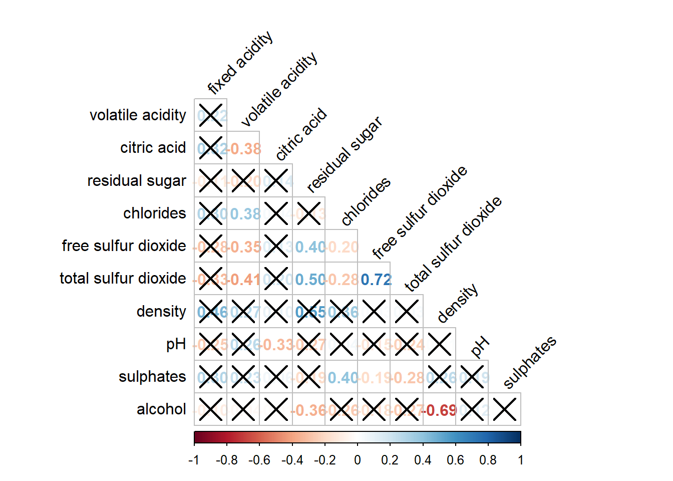
Method 3: ggpairs()
Noticed that we only study the correlation relationship between all the continuous data. What if there is categorical and continuous data and u would like to plot everything at one glance?
In the generalised pairs plot: categorical vs categorical: bar categorical vs continuous: boxplot continuous vs continuous: scatterplot
exam <- read_csv("data/Exam_data.csv")Rows: 322 Columns: 7
── Column specification ────────────────────────────────────────────────────────
Delimiter: ","
chr (4): ID, CLASS, GENDER, RACE
dbl (3): ENGLISH, MATHS, SCIENCE
ℹ Use `spec()` to retrieve the full column specification for this data.
ℹ Specify the column types or set `show_col_types = FALSE` to quiet this message.ggpairs(data = exam, columns = 4:6)`stat_bin()` using `bins = 30`. Pick better value with `binwidth`.
`stat_bin()` using `bins = 30`. Pick better value with `binwidth`.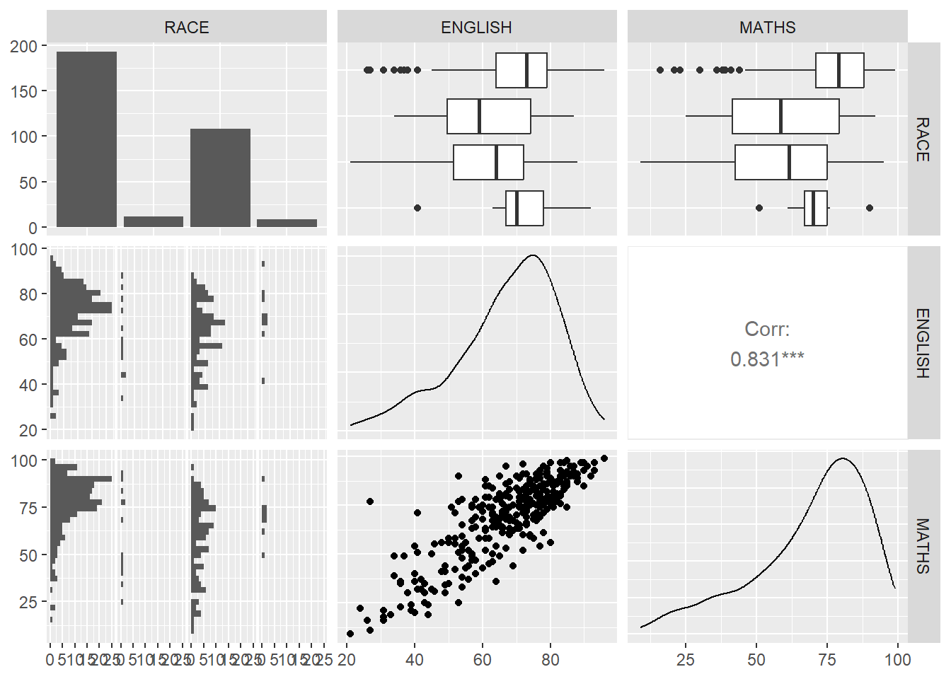
What if there is more than two vairables?
Method 4: Ternary Plot using ggtern to study the relationship between 3 variables
pop_data = read_csv("data/respopagsex2000to2018_tidy.csv")Rows: 108126 Columns: 5
── Column specification ────────────────────────────────────────────────────────
Delimiter: ","
chr (3): PA, SZ, AG
dbl (2): Year, Population
ℹ Use `spec()` to retrieve the full column specification for this data.
ℹ Specify the column types or set `show_col_types = FALSE` to quiet this message.pacman::p_load(ggtern,plotly)Create three new age groups young, economic-active and old.
agpop_mutated <- pop_data %>%
  mutate(`Year` = as.character(Year))%>%
  spread(AG,Population) %>% # transform the table using pivot wider
  mutate(YOUNG = rowSums(.[4:8]))%>%
  mutate(ACTIVE = rowSums(.[9:16]))  %>%
  mutate(OLD = rowSums(.[17:21])) %>%
  mutate(TOTAL = rowSums(.[22:24])) %>%
  filter(Year == 2018)%>%
filter(TOTAL > 0) #no record of the total pop is 0.ggtern(data=agpop_mutated, aes(x=YOUNG,y=ACTIVE, z=OLD)) +
geom_point() +
labs(title="Population structure, 2018") +
theme_rgbw()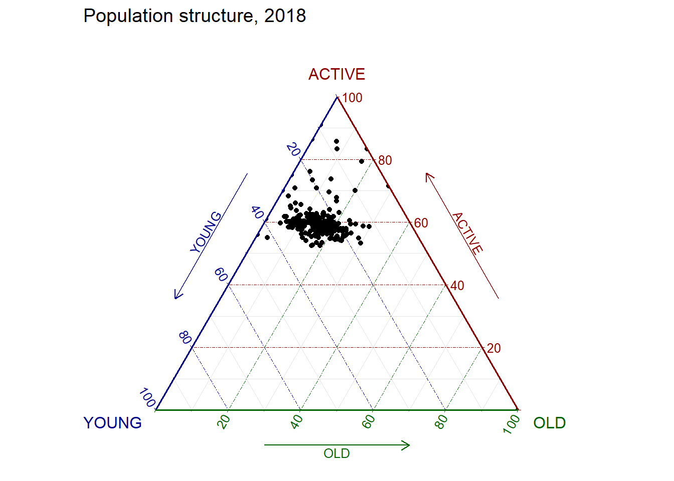
Make improvements to make the above diagram interactive. In this example, since ggtern is an extension of ggplot2, we could not use ggplotly directly.
label <- function(txt) {
  list(
    text = txt,
    x = 0.1, y = 1,
    ax = 0, ay = 0,
    xref = "paper", yref = "paper",
    align = "center",
    font = list(family = "serif", size = 15, color = "white"),
    bgcolor = "#b3b3b3", bordercolor = "black", borderwidth = 2
  )
}

axis <- function(txt) {
  list(
    title = txt, tickformat = ".0%", tickfont = list(size = 10)
  )
}

ternaryAxes <- list(
  aaxis = axis("Young"),
  baxis = axis("Active"),
  caxis = axis("Old")
)

plot_ly(
  agpop_mutated,
  a = ~YOUNG,
  b = ~ACTIVE,
  c = ~OLD,
  color = I("black"),
  type = "scatterternary"
) %>%
  layout(
    annotations = label("Ternary Markers"),
    ternary = ternaryAxes
  )
No scatterternary mode specifed:
Setting the mode to markers
Read more about this attribute -> https://plotly.com/r/reference/#scatter-modeWhat if there is more than 3 variables? ## Method 5: heatmap (cell based) columns: variables rows: observations
pacman::p_load(seriation, dendextend, heatmaply)
wh <- read_csv("data/WHData-2018.csv")
Rows: 156 Columns: 12
── Column specification ────────────────────────────────────────────────────────
Delimiter: ","
chr (2): Country, Region
dbl (10): Happiness score, Whisker-high, Whisker-low, Dystopia, GDP per capi...
ℹ Use `spec()` to retrieve the full column specification for this data.
ℹ Specify the column types or set `show_col_types = FALSE` to quiet this message.row.names(wh) <- wh$Country #to rename the rows (change object ID) hence heatmaply will use it to label the axis laterWarning: Setting row names on a tibble is deprecated.wh1 <- dplyr::select(wh, c(3, 7:12))
wh_matrix <- data.matrix(wh)Interactive heatmaply (supported by shiny)
heatmaply(percentize(wh_matrix[, -c(1, 2, 4, 5)]))Method 6: kmean clustering using parallel coordinate
static: ggparcoord() interactive: parallellplot using ds3.jt
pacman::p_load(parallelPlot)histoVisibility <- rep(TRUE, ncol(wh))
parallelPlot(wh,
rotateTitle = TRUE,
histoVisibility = histoVisibility)